Without
On friction, meaning, and the (dead-)end of looking like everyone else
March 2026
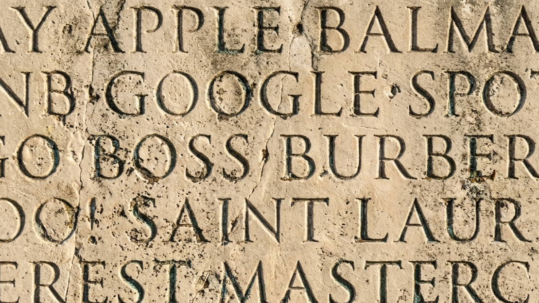
Open your browser. Go to any ten major brand websites. Now squint your eyes. Strip the color, ignore the photography – just look at the type. You'll see the same thing ten times. A sans-serif font. Geometric. Clean. Bold. Functionally identical. You could swap the wordmarks between half of them and nobody outside a design team would notice.
This is where we ended up. Google, Airbnb, Pinterest, Burberry, Spotify, eBay, Yves Saint Laurent – one by one, over the course of roughly a decade, they all walked into the same room and came out looking the same. Different industries, different audiences, different histories. Same typeface. Same feeling. Which is to say: no feeling at all.
I'm not here to declare war on the sans-serif. That would be missing the point. What I want to talk about is how we got here, what we lost on the way, and what the slow re-emergence of serifs, quirky logos, and typographic friction tells us about where things are going.
How we got here
It started with screens. Early digital displays punished complexity. Thin serifs broke apart at low resolutions. Stroke contrast created artifacts. The sans-serif survived where the serif stumbled, and because it survived, it became synonymous with the medium itself – with digital, with modernity, with the future.
Then, around 2002, Apple quietly went all in – swapping Apple Garamond, the serif that had defined its brand for nearly two decades, for Myriad, a sans-serif font, across its marketing and packaging. I remember that shift vividly. It felt definitive. If the most design-literate company on earth decided serifs were over, who were you to argue?
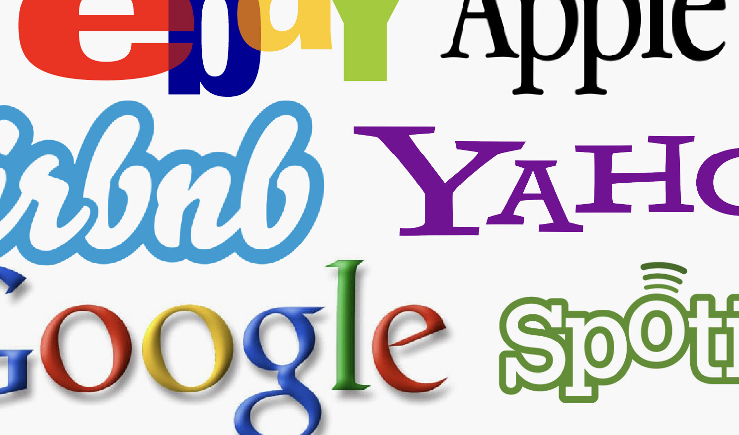
What followed was contagion. The large tech brands stripped their logos down – Google went flat, eBay lost its overlapping playful colors, its baseline shifts, its whole personality. Though not originally based on a serif font, that eBay moment is worth talking about, because it tells the story perfectly and it shows what I mean by friction and personality. The old logo was chaotic and fun – it encoded the actual experience of the platform: a global garage sale, messy and human. The new logo was clean, neutral, professional. It was also the moment eBay stopped being eBay and started trying to be Amazon. The typography didn't lie. It just told the truth about a company that had lost its own story.
Then fashion followed. The houses that had built entire mythologies around their typographic identities – Burberry, Gucci, Balmain, Saint Laurent, Celine – dropped them for geometric sans-serifs that were, in several cases, literally the same font. Heritage dissolved overnight into something that could have been a coworking space.
And then it reached its logical conclusion: the era of the unpretentious. The design movement that celebrated the absence of design. Startups didn't even have to think anymore. Pick a sans, type your name, done. No craft, no friction, no point of view – just a word in a neutral font and a pitch deck. Branding without the brand.
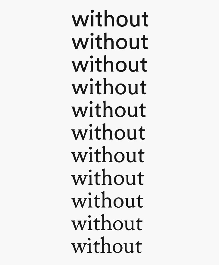
A typeface named after its own absence
Here's the thing that hides in plain sight. Sans-serif. Without serif. It's a typeface defined by what it lacks. Named after its own negation. The dominant visual language of an entire generation of brands is literally a category that defines itself by what it's missing. You couldn't write a better metaphor if you tried.
A serif gives a letterform surface – actual, physical surface. More edge, more ink, more material for meaning to cling to. And that's not an accident of design – it's an accident of history.
Roman masons drew letters onto stone with ink and brush before cutting. The pressure and movement of the brush left enlarged strokes at the terminals – little artifacts of the hand meeting the surface. Over centuries those details got absorbed into how we read. Gutenberg cast them in metal. Every typographic era carried them forward. The serif was never invented. It was inherited – the fossil record of making, passed down from brush to chisel to movable type to pixel grid.
The serif creates grip, both optically and semiotically (where meaning is created). Your eye catches on it. Associations, history, craft – they have somewhere to attach. The sans is smooth. Frictionless. And frictionless surfaces don't hold anything. Things slide right off.
I know this firsthand. At EF, we spent real time discussing our brand typeface, EF Circular – how it embodied the perfect blend of academic and adventure (EF's juxtaposing brand pillars). And within our design team, we genuinely believed that. We could see it. But here's the honest question: could anyone else? Could the audience feel the difference between our carefully chosen sans and any of the thirty other geometric sans-serifs they encountered that day? I'm not sure they could. We were having a hairdresser-league conversation – debating micro-distinctions, like "that lowercase e is more friendly than Helvetica" that were invisible to everyone who actually mattered.
That's the fundamental problem. A sans can carry meaning, but only meaning that's loaded onto it from outside – through repetition, through context, through the enormous machinery of brand building. It arrives empty. You have to fill it. A serif arrives already speaking. Not saying everything, but saying something. It has texture, history, a point of view baked into its forms. One is a blank vessel. The other is already in conversation.
Friction is not the cost – it's the product
The logic of the sans era went like this: friction is bad. Friction slows things down. In a world of infinite scroll and shrinking attention, the fastest, cleanest, most frictionless option wins. So strip it all away. Optimize for speed, for throughput, for data-efficiency – both technically and visually.
That logic wasn't wrong actually – it was just incomplete. Because here's what it missed: friction is the mechanism of character.
Think about what makes a face memorable (pun intended). It's never the symmetry. It's the bump on the nose, the gap in the teeth, the scar above the eyebrow. The specific irregularities that resist the generic. Character, typographic and otherwise, is the sum of a thing's resistances. It's what remains when you stop trying to be frictionless. Think different? I bet everyone old enough to remember that Apple campaign doesn't just remember the brilliant line – they have its typeface, Apple Garamond, burned into their forehead. At least I do. The most famous call to nonconformity in advertising history was set in a serif.
A serif is a tiny act of resistance against the eye's forward momentum. A bracketed terminal is where personality shows up. Stroke contrast creates tension, drama, warmth.
The real shift in thinking isn't that slowing down is an acceptable cost for meaning. It's that slowing down is the meaning. In an economy where everything is optimized for velocity, the thing that makes you pause is the thing you remember. Friction isn't what you sacrifice. Friction is the signal. It says: we cared enough to make a choice that costs us something. We're not trying to be everything to everyone. We're willing to be specific.
Something is turning
I don't want to overstate this. I'm not saying the serif is back and the world is healed. But something is moving, and you can see it if you pay attention.
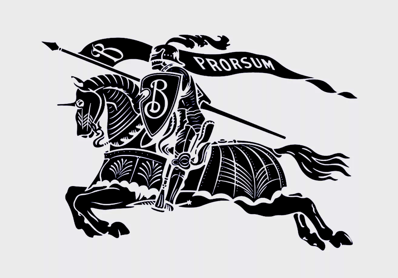
Burberry reinstated a serif-based wordmark under Daniel Lee. Not the old one – a new one that carries the memory of the old one – along their reworked chevalier logo. It's a quiet declaration: we are not a startup. We have weight. On their website they recently went full serif. Other fashion houses are following or reconsidering. In editorial design, in packaging, in the branding of companies that want to signal substance, the serif is reappearing. You don't need to look far – our upper echelons of AI, Claude among them, all serif. The typewriter tool I'm using to write this very essay: serif.
But the serif is just one signal. The broader shift is the return of the quirky, logos with personality, imperfection, texture. For a decade the unspoken rule was: professionalism equals polish equals geometric sans. A quirky logo would have been read as unserious, unscalable, risky. The fact that large brands are now embracing imperfection again tells you something fundamental has changed in what trustworthy looks like. Trust doesn't come from looking clean anymore. It comes from looking like you actually stand for something – even if that something is a little odd, a little rough, a little resistant.
But it's not just a reversed game here. It's not serifs replacing sans, the way sans once replaced serifs. It's a deeper correction – a recognition that typographic choice was always a form of self-expression, and that for too long, too many brands answered that question by refusing to answer it.
Beyond the letterform
Zoom out far enough and this stops being about typefaces at all.
What we optimized in typography, we optimized everywhere. In business models: strip it down, scale it up, make it frictionless. In brand strategy: be universal, be neutral, be everything to everyone. In product: minimize, simplify, remove – no part is the best part. The result was a commercial landscape of interchangeable companies selling interchangeable things in interchangeable voices. Efficient. Scalable. Forgettable.
Something's shifting. Not because someone declared a trend, but because the emptiness became unbearable. People are reaching for texture – in the brands they choose, in the things they buy, in the stories they want to be part of. The companies gaining traction right now aren't the cleanest or the most optimized. They're the most specific. The ones willing to be particular at the cost of being universal.
The serif is one small, visible piece of that. A letterform with enough surface to hold a story. Enough friction to make you pause. Enough history to remind you that someone made a choice here – and choices, in a world drowning in defaults and AI slop, might be the most valuable thing a brand can make.